Ocean Blue Water Products
New product launch
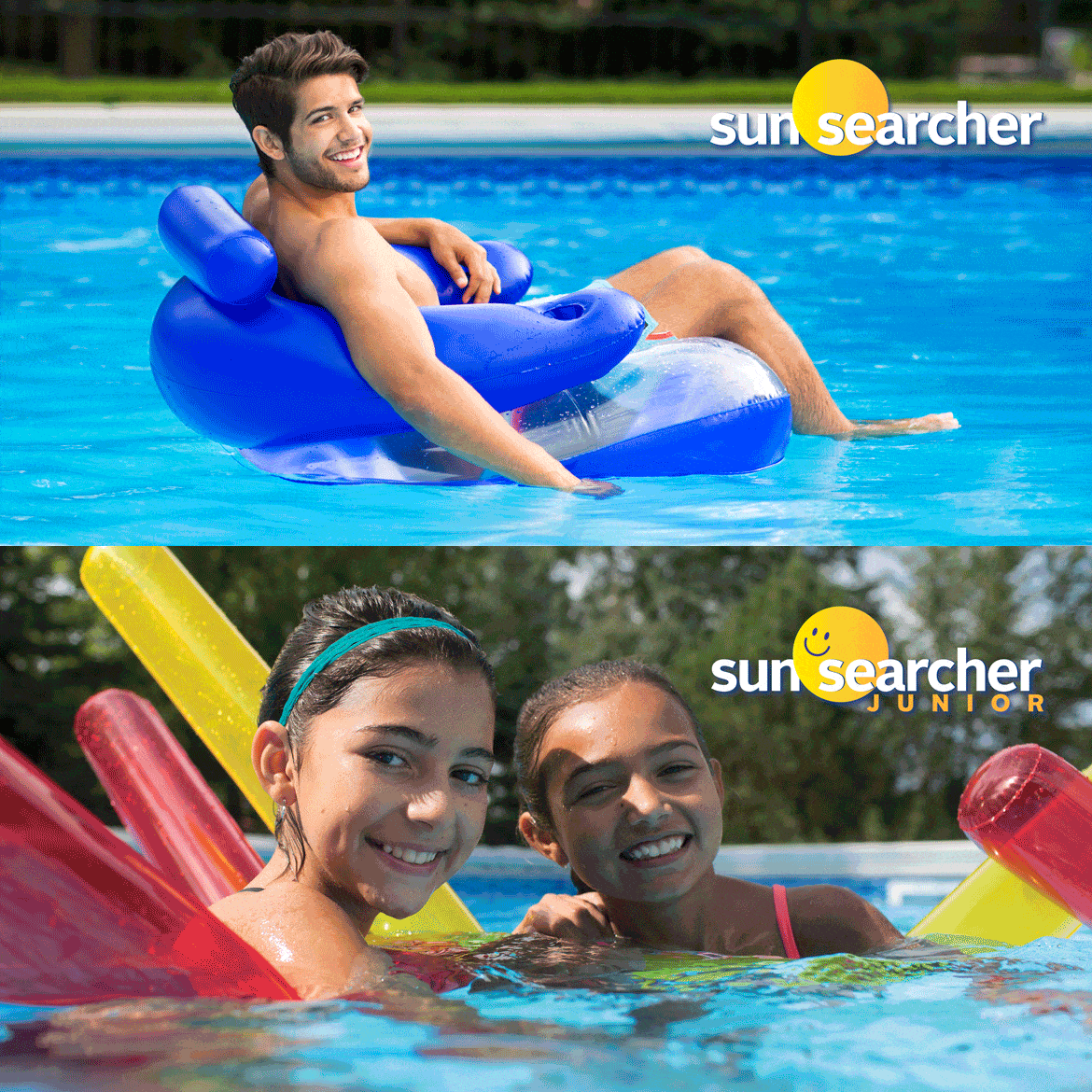
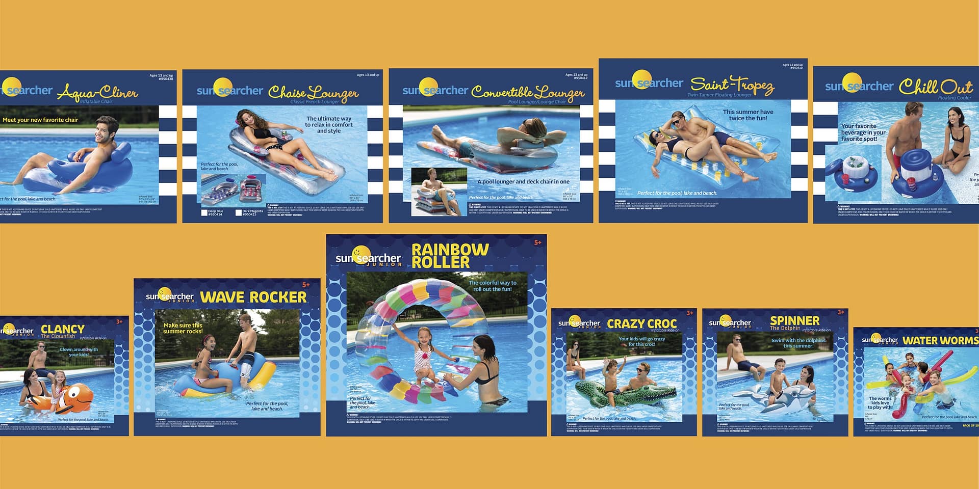
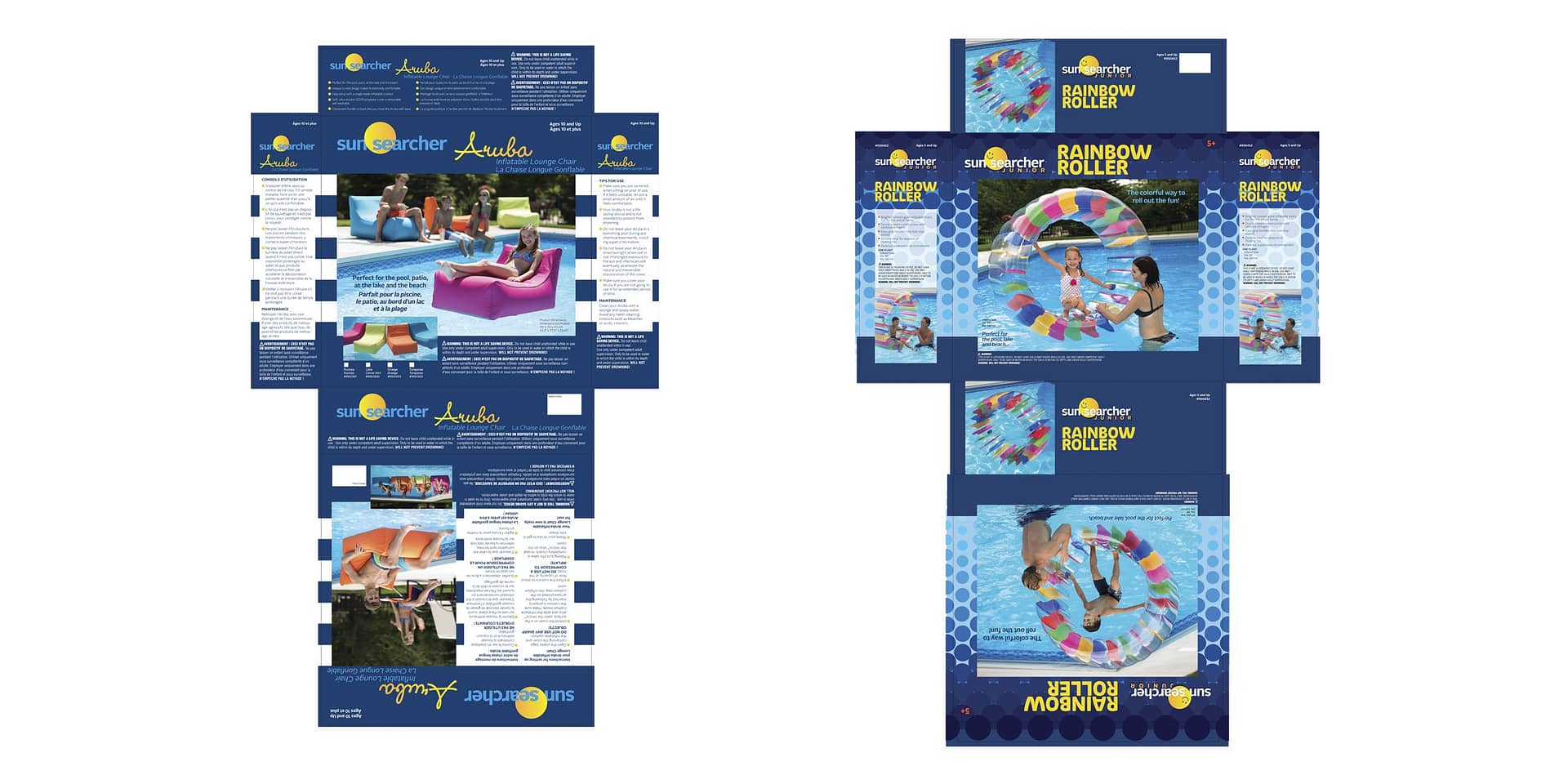
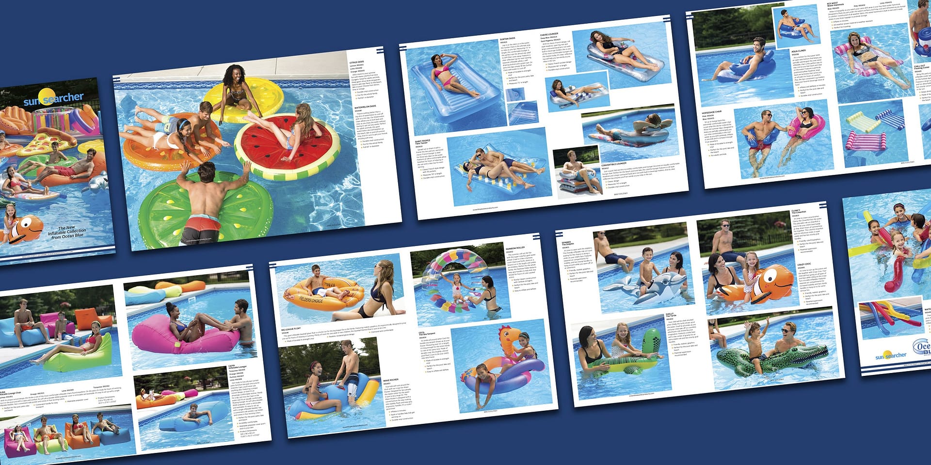
Our longtime B2B client came to us with the idea of launching an inflatable line of pool toys and floats to both consumers and distributors. They needed everything from a rebranded logo, product naming, product copy and modular package design for 22 adult and kid products.
SCOPE OF WORK +
RESPONSIBILITIES
Creative Director + Lead Designer
Rebranded Logos
Package Design
Collateral Design
Photo Direction
Copy Direction
Production
Project Management
problem
Our client had an old brand they purchased called Sun Searcher. They were testing out a few products using that existing brand without much success. The logo was dated and very generic, the packaging looked like everything else on the shelf. They needed distinctive branding that would extend the Ocean Blue family of products and offer both adult and kids lines under a new Sun Searcher/Sun Searcher Jr brand with the caveat the packages be blue and the products launch in 3 months for the November selling season. And package printing and shipping from China to be ready for January delivery.
insight
We conducted store visits to discover what the competition was doing and how packaging was being displayed on shelves. We learned most packaging was very busy and almost all of it some kind of blue. There is little brand awareness in this niche, people buy pool toys and toss the box. To stand out we needed a distinctive design element that would brand the boxes together on the shelves, even if they were mixed in with other company’s products. We were going to need extensive photography for the 22 products in the launch, both lifestyle and product images, a process unfamiliar to the client. We determined a minimal logo treatment would be cleanest on packaging with many required elements.
solution
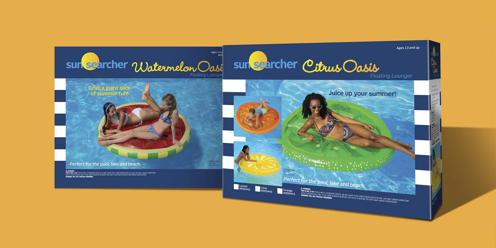
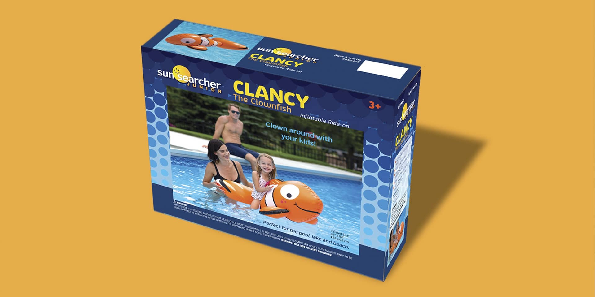
We addressed the tight schedule and held the photoshoot 3 weeks after getting the assignment — before local pools closed and kids went back to school. We utilized graphic, summery awning stripes for the adult packages and created a minimalist logo with a sun, turned smiley face and complimentary packaging with graident bubbles for the Junior lineup. The bold, clean designs of Sun Searcher and Sun Searcher Jr stand out as a family even when mixed in with the competition. Good planning made sure the sales brochure and website additions utilized assets from the packaging photoshoot to amortize costs and assure on time deliverables.
Honest, purpose driven branding lights me up.
Let's connect.
© 2024 Sue Johnson Design
