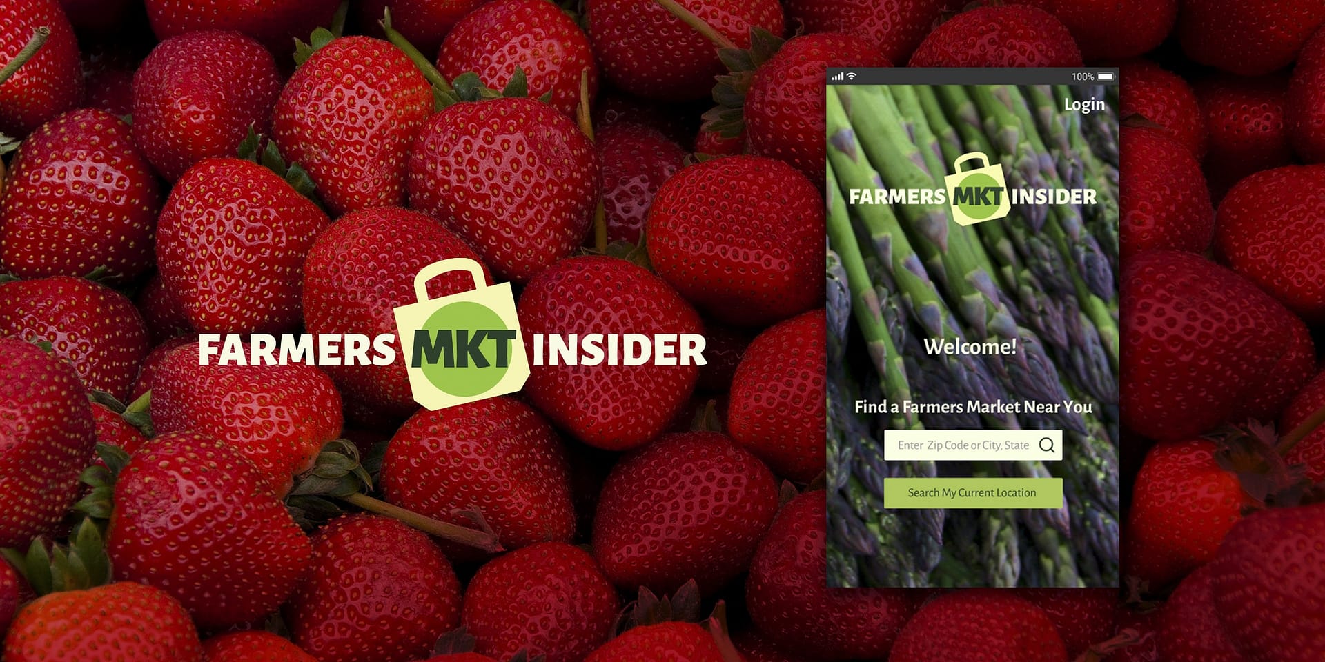
Farmers MKT Insider
CASE STUDY: Mobile app
SCOPE OF WORK +
RESPONSIBILITIES
Lead UX Designer
Product Ideation
UI/UX Design
Usability Testing
Prototyping
User Research
Copywriting
problem
How might we make Farmers Markets easier to shop and navigate? User interviews identified key needs as easier access to Farmers for fresh produce and current Farmers Market information so visitors know what to expect when they arrive at a market. Design a product and determine if this could be a successful new mobile app.
insight
Additional research interviewing both loyal and infrequent farmers market users identified a long list of feature requests empowering them to “know before they go”. Giving them the opportunity to make the most of their experience.
solution
Create a minimum viable product to prototype, test and determine if this was a new product worth pursuing. Features were identified, developed and tested successfully in an eight week design sprint.
CASE STUDY
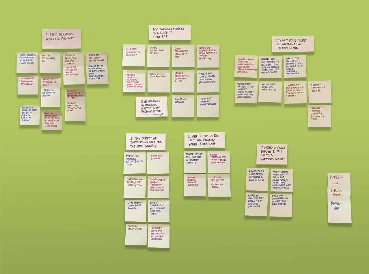
Interviewing farmers market shoppers from across the country provided insite. Affinity mapping identified two key user needs.
- I want easy access to farmers for fresh produce.
- I want current farmers market information so I know what to expect when I get there.
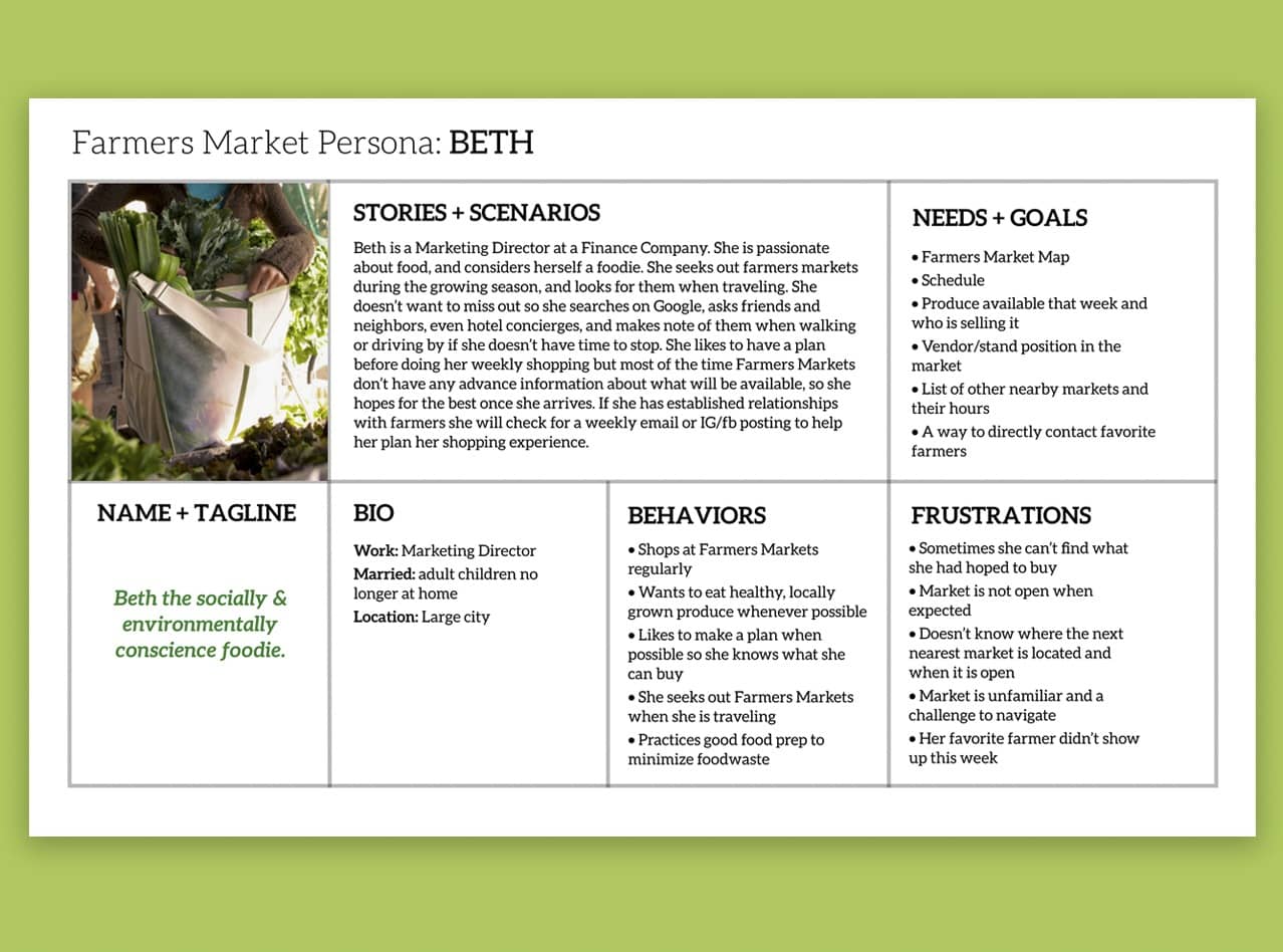
What do very loyal and infrequent, well intentioned farmers market shoppers think about farmers markets?
“How might we make farmers markets easier to shop and navigate?”
Initial wireframe sketches included many user wants identified during interviews and affinity mapping.
- Farmers Market times and parking info
- What produce will be available this week
- Vendors lists and what they have to offer this week
- Option to Chat with a Vendor
- Market map showing Vendor locations
- A shopping list function and a way to save it to your account
- List of Market Events
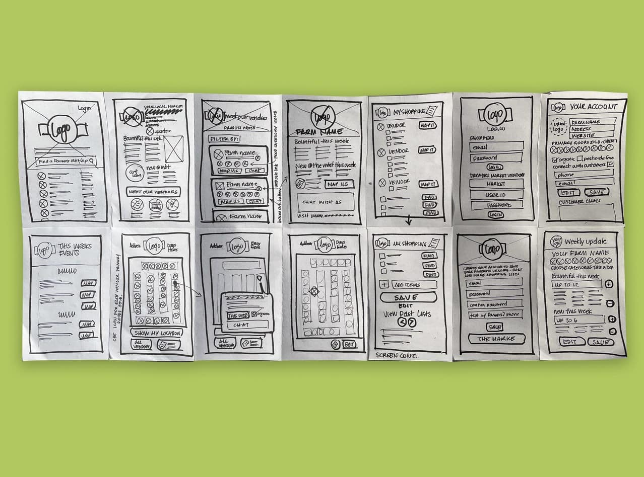
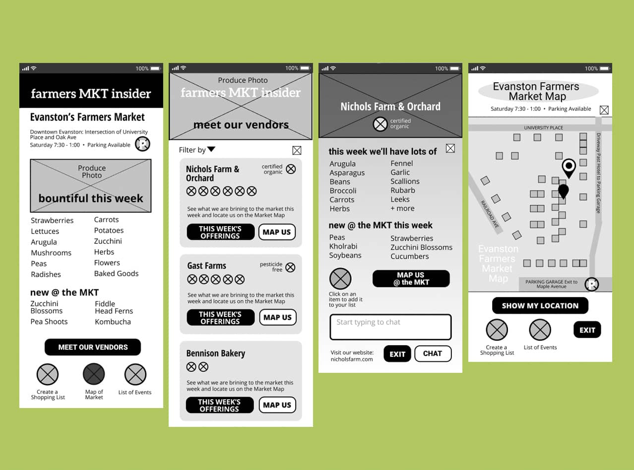
With so many good ideas identifying an MVP was essential.
2 x 2's narrowed down the minimum viable product. The Farmers MKT Insider feature prioritizations to work up in a mid-fi design became:
- Market Overview
- Vendor List
- Vendor Profiles with a list of current offerings
- Interactive Market Map
Usability-testing sessions sent me back to the drawing board.
The navigation needed work. Clearer language and organization of buttons changed. Users wanted far more comprehensive full vendor profiles including vendor photos as many shoppers didn’t know farm names, but new their friendly vendors. They felt the market map should show their location any time they opened the map. And all users wanted an additional parking map and more information about available parking — that was surprising!
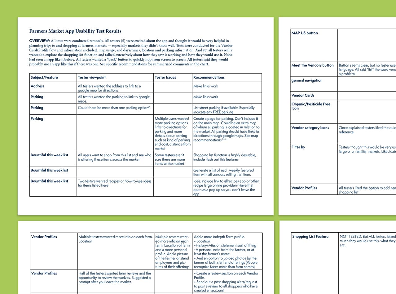
As the high fidelity design was developed and tested for accessibility it was discovered there were problems with the greens and they needed more contrast. Brand colors were easily changed as this was a new product under development, if this was for an established brand I might need to use the colors differently as changing them might not be an option. Icons were created to simplify navigation quickly and help users identify what kind of offerings a vendor would have available that week
91% of testers completed the mission in a high fidelity Maze test, but when presented live some users didn't love the colors.
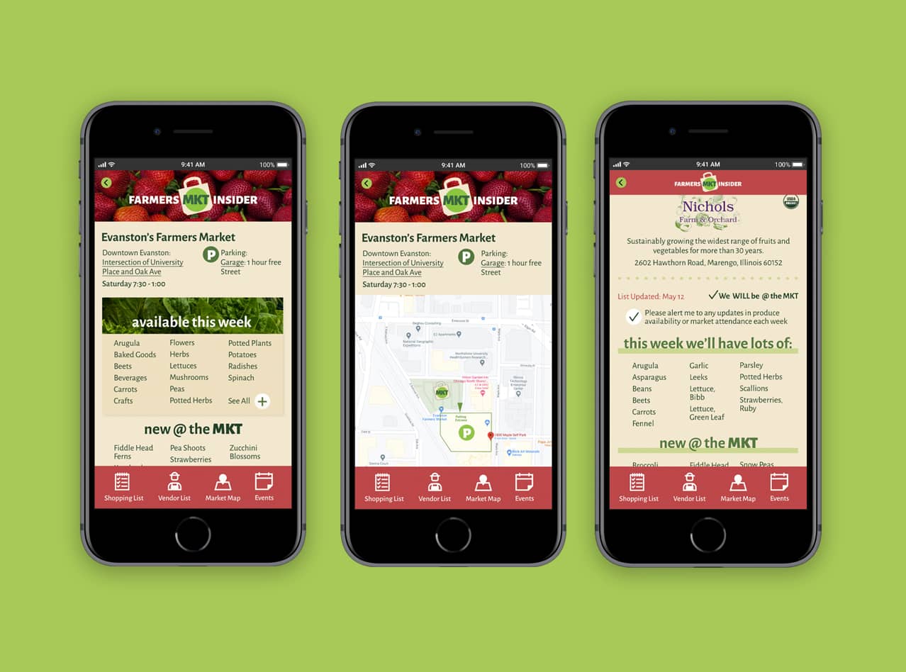
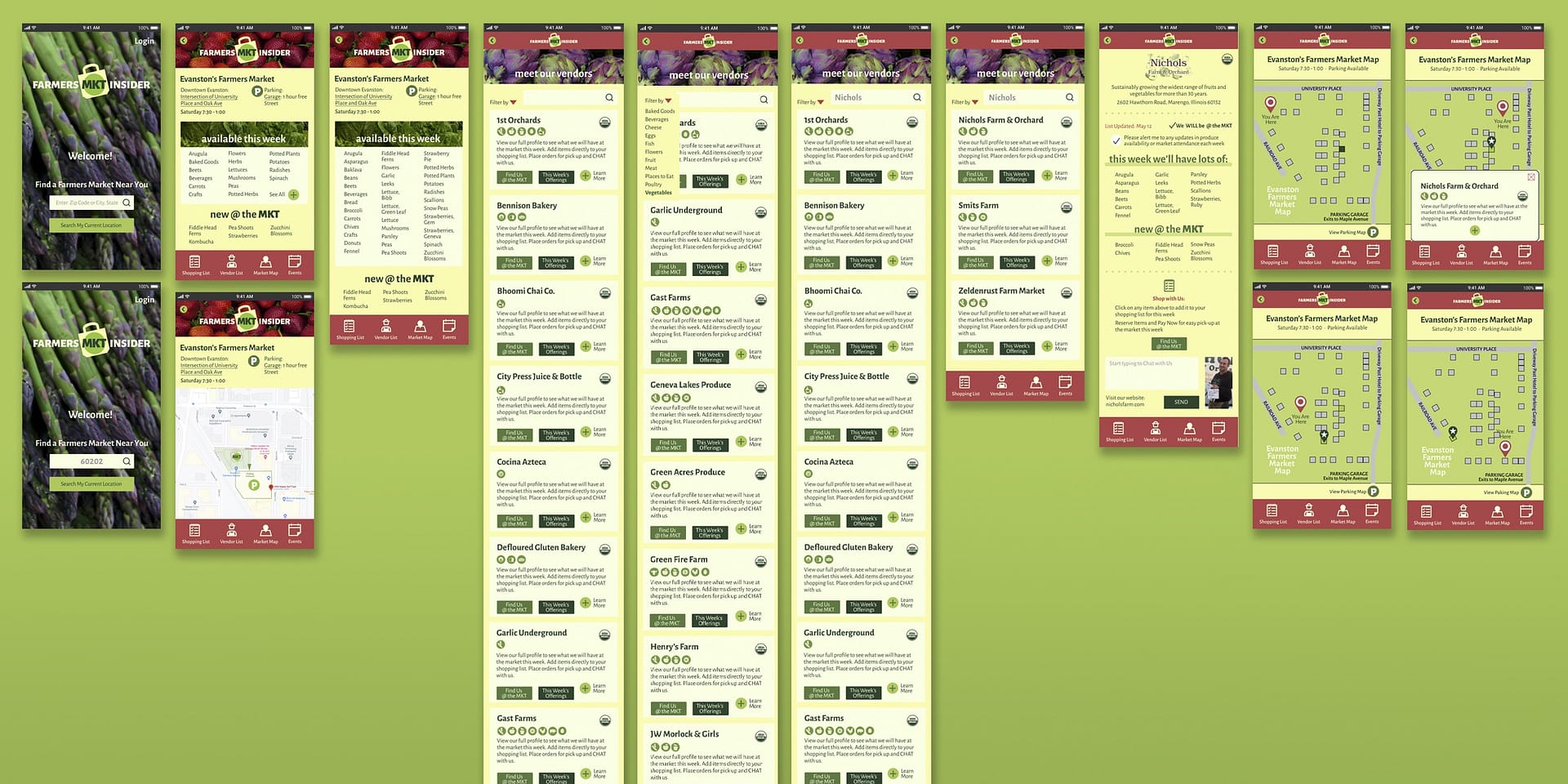
My user paths were successfull. However presenting it live to a group of 18, aged 20 – 55, some users thought the color palette could be brightened for a happier experience. I replaced the wheat background with a sunny yellow, keeping the farm inspired color palette and retested for accessibility. Custom icons and a simple design system visually reinforce THE HUNT variable reward built into this product. Showing up at a farmers market and finding what you are seeking is very satisfying. Buying it from your favorite vendor, even more so. The Farmers MKT Insider app makes the likelihood of that happy conclusion much more possible.
Research, flexible visual design and testing demonstrate the Farmers MKT Insider App could be a functional, reliable, useable product giving Farmers Market Shoppers a better market experience.

What's next?
Research, create and test:
• A shopping list feature
• Vendor account side features
• And if those are successful, research city/town engagement to determine how might we make this a marketing tool for local chambers of commerce and a revenue generator for all.

Honest, purpose driven branding lights me up.
Let's connect.
© 2024 Sue Johnson Design